
AI Put More Work in Flight. You Won't See the Slip Coming.
A diagnosis, a countermeasure, and one real case. Three months of system work, and the target they kept red on the wall.

Your teams ship more than ever. AI writes a real share of the code now; more work is in flight; every project looks like it is moving. Then a date slips, and nobody saw the collision coming.
I watched this break before AI was in the room, which is why I trust the pattern. It is about two project managers I was working with. They were managing eighteen BI projects across four continents. The on-time delivery rate was 24%.
When I arrived, I asked one question: where can I see the status of all the projects together? Nobody could point to a single view. Each manager tracked their own work in spreadsheets and email threads. Neither could say how their timelines overlapped or identify a potential delivery issue risk.
Here is the pattern I see, and what works.
The division head was not short on reporting. He had plenty of it. But, status reports arrived late, told different stories depending on who wrote them, and never showed a milestone collision until the damage was done. Client satisfaction sat at 5.5 out of 10, trending down. One of four projects hit its deadline.
The standard response to this situation is more reporting: a new PMO tool, a weekly steering deck, a dashboard pulling from Jira.
It fails for one reason: it treats visibility as a data problem, which it isn’t.
The data existed. It lived in a dozen places, formatted in many different ways; each one true and none of them whole. What was missing was visibility into milestones, dependencies, and potential projects’ collisions. That visibility only appears when everything sits on one surface. These project managers lacked the ability to see a problem before it became a crisis.
So we built an Obeya. It is a room where the whole portfolio lives on the walls. It has three zones. A strategy wall tying every project to the CIO’s targets; a performance dashboard, six handwritten charts updated weekly: on-time delivery, defects per delivery, satisfaction, pace, risk, budget; and a macro planning wall, all 18 projects on one timeline, planned milestones marked, actual progress in sticky notes.
Building the first version took a two-day workshop, paper, and markers. No software was bought.
The wall paid for itself in the first week. Projects were competing for the same testing resources in the same weeks. Go-lives piled up at quarter end because nobody had ever seen the full picture. One project manager said it out loud: “Now I understand why we keep missing dates.”
The conversations changed too. Before, “are we on track” depended on who you asked. After, the division head stood at the defect chart, saw the trend laid out week by week, and asked a different question: what is causing this?
Visibility alone fixes nothing, though. The wall surfaced the problems; structured problem-solving closed them. Three PDCA cycles ran in that room. One rescued a 23-report go-live that the math said would slip. One fixed the vendor’s defect quality, after I sat next to a developer and watched him mark a broken PDF export “OK” because the test script only said, “verify PDF export.” One turned a client complaint about a local project into a checklist the team still uses.
Three months later, with the same team and vendor, on-time delivery increased from 24% to 55%. Defects per delivery dropped from 38 to 19. Client satisfaction climbed from 5.5 to 9.4. Delivery pace tripled, from 9 projects delivered in October to 27 by December.
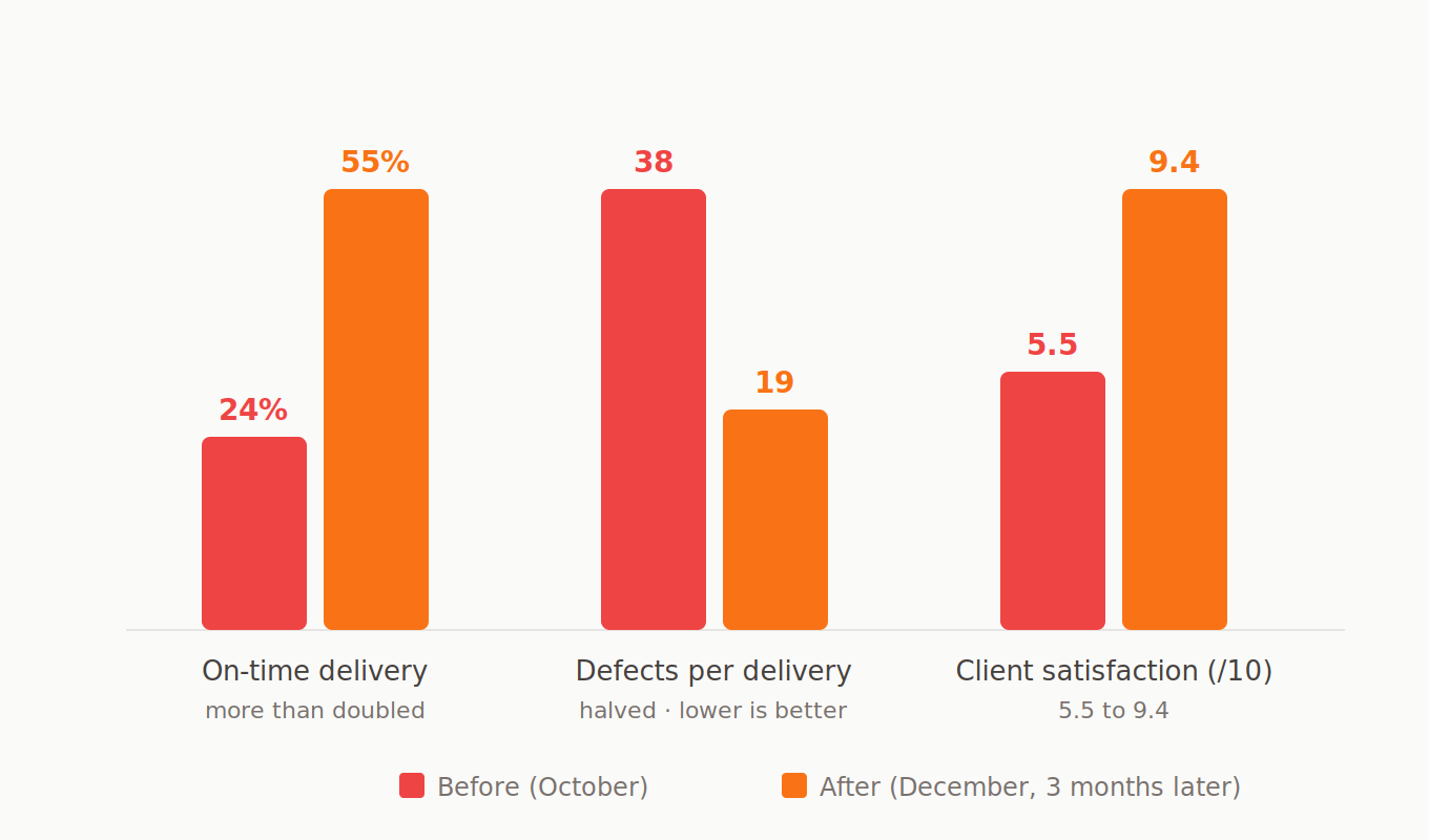
One number needs a second look, and it’s the one most case studies would round up. The strategy wall set the on-time target at 60%. The team reached 55. That chart was still red when I left, visible to everyone who walked in every week. I count that as a feature. A system that keeps your remaining gap on the wall beats one that lets you declare victory early.
Project portfolios don’t have a skills problem. They have a system that hides the collisions, and the collisions eat the dates.
That team had no AI anywhere in its toolchain. Yours does. The collisions are the same; there are just more of them, and they stay invisible until a date is already gone.
Put the work on one wall first. The delivery follows.
The three cycles that produced those numbers are written out in full in the case study.
If you want to see where your own system leaks, the Delivery Scorecard takes two minutes. Ten questions, and you know where to look first. And if your portfolio looks like this one, I run a half-day working session with leadership teams on exactly this. Reply to this email, or message me directly on Substack, and I’ll send you the outline.